Functionality matters
Every business owner should be required by law to write the following on their bathroom mirror: my website is a tool, not a billboard. Sure, having a nice-looking website can help make a sale, but the primary purpose of a website should always be functional.
The function of every website is to give potential customers the information and tools necessary to make a purchase. Since most users will bounce within five seconds, your homepage needs to give them enough information to make a decision, and a button to press to move forward with the purchasing process, in under five seconds.
Function, not style, is the name of the game. An effective website MUST have the following components:
Short, Effective Messaging
You want to get all your crucial messaging across in as few words as possible. You should be able to sum up what your company does in three words or less, for example, “Professional Website Design.” All other information on the page should be immediately relevant to what visitors are looking for. If you need a lot of text to describe your services, divide your services up into categories. That way, visitors can decide what text is relevant to them and whether to read it.
Sales Funnels
You should design your website with sales funnels in mind. A sales funnel usually consists of an appealing product image with a strong call-to-action such as a form.
The best way for your landing page to lead into Sales Funnels is through “calls to action,” requests that visitors click on buttons. These can be “learn more,” “sign up,” “free trial,” or any similar statement. The shorter, the better, because calls to action work best when they fit onto clickable buttons. Each call to action should take a visitor one step forward in the Sales Funnel towards the exact product that they want to buy.
Not losing customers in the buying process
Don’t you hate it when you call a government department and have to go through seven touchtone menus just to talk to a real person? Well, a lot of people, especially people who aren’t internet-savvy, feel the same way when they have to hunt down your contact page.
Because of this, your landing page should include a phone number and a contact form above the fold. This lets people get right to the point where turn a visitor into a lead.
Making it easy to buy
Your visitors want to buy your products and services. That’s why they Googled your keywords in the first place. Your job is to make a website that is a tool rather than an obstacle. All other design considerations come second.


These are great tips! I didn’t realize that users “bounced” within 5 seconds of visiting a website, that’s a small frame of time to make an impression. As I prepare to launch my first website I will pay particular attention to my homepage and creating sales funnels. Thanks for sharing the information.
It seems nowadays that the popular thing is to have a “barely there” homepage which tells you nothing and forces you click someplace in order to get even the most basic of information. This all but eliminates their bounce rate, but it irritates me to no end. Don’t make me guess what your site is about.
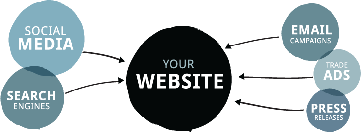
One of the most important things is to address relevant issue. The ineractions eith search engines and media are also important..