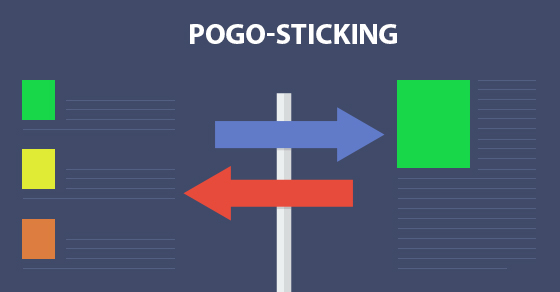
Getting to the top of a search engine result page is a great achievement but don’t celebrate yet: if all those searchers clicking on your site don’t find what they are looking for quickly they will hit the back button and click another result. This is called pogo-sticking and search engines, including Google, are able to monitor this behavior and use it in their search algorithms. This is not the same thing as bounce rate which refers solely to when users leave your website.
The best websites satisfy searchers and have a low pogo-sticking rate but this does not mean they have a low bounce rate. High bounce rates can mean two things after all:
-
Your website is attracting the wrong kind of traffic; or
-
Your website is attracting exactly the right traffic.
It all depends on the type of website. Websites that simply aim to provide information (Wikipedia for example) will have high numbers of unique visitors and pageviews as well as high bounce rates due to users entering the site on the page they want, finding the information they require, and leaving. These users are not going back to search results and trying another link, their request has been satisfied.
Solutions for Websites with High Pogo-Sticking Rates
-
Get in the searcher’s head: Ask yourself what information the user is expecting to find when they make certain searches and tailor your landing pages to meet their needs, not just the needs of potential customers. Split test different versions of your pages to see what makes people engage vs leave. If you’re not sure what to include ask friends, longtime customers, and employees what results they would expect for search terms you are targeting.
-
Improve Design and Coding: If you cannot honestly say that your website is the most functional, usable, beautiful, and highly-visual website in the search results, fix it. Design plays a huge part in consumer decision-making processes and many users will dismiss a website simply because they do not like the aesthetics or functionality. This includes the load time of your website: Amazon.com has found that each 100 millisecond delay decrease conversion rates by up to 1%!
-
Mobile Support: Mobile devices are responsible for a rapidly expanding section of the search market. Upgrading to a responsive website design will help lower your pogo-sticking rate by allowing users on any device to access the information they seek. Separate mobile-friendly websites are also an option but they can frustrate users when they do not properly redirect or do not contain all of the same information.
-
Avoid Pop-ups and Distractions: While many websites use pop-ups as an aggressive call-to-action to increase newsletter subscription rates and signups, many customers find them annoying. Let your user spend some time on site looking around and discovering the information they were seeking before asking them to hand over their email address. Similarly, embedded video or audio that auto-plays upon loading can be distracting and even invasive. Many people find noise pollution very aggressive and will simply click away from noisy pages even if they provide the answer being sought. Use multimedia presentations to entice, not drive away, searchers and potential customers by leaving control in the users’ hands.
-
Use New Windows for External Links: The last thing you want is searchers leaving your website unintentionally because they clicked a helpful link. Set all external links to open in a new tab or window to ensure users have an opportunity to look around before leaving.
-
Internal Search: Searchers are used to being able to simply search for what they want instead of hunting through menu options. By providing this functionality on your website, you improve the likelihood that users will try again to find the information they wanted instead of simply bouncing back to their search results.
-
Keep Content Readable: Consider your target audience and make sure your content is written in a way they can easily understand and digest it. Try not to estrange your customers by using esoteric or confusing language, this will simply drive most people to look elsewhere. If you are not sure what the average reading level of your website is, there are online tools available to help you assess and correct your content. Also, remember to split up long articles into multiple pieces or pages to suit searchers shorter attention spans, it will make your content easier to come back to and prevent the dangerous “too long, didn’t read” response.
Finally, consider creating helpful custom 404 pages for your website. If something should go wrong or users somehow end up on a missing page, help them get back to the homepage or provide a search function that will aid them in finding the right page or something similar. If nothing else, take an example from Reddit: some design and humor will at least encourage the searcher to come back later by making an impression on them.
Hopefully you found this article helpful and informative – try out these seven tips on your website and see the difference it makes for yourself!


